
YOUR SPREADSHEETS ARE FAILING YOU
5 Ways Visuals Unlock Event Data
If you’ve been reading The Bee’s Knees for a while, you know we have a major theme here: Track. Your. Data! So maybe you’ve listened to that advice (well done!) and you’re thinking: now what?
We’re revealing 5 ways to look at event data that FINALLY tell us what the numbers mean once you have them. We’re using waste numbers as an example because a lot of events have ready access to the data that we’re going to walk through, but it helps to look at any of your data visually no matter the area whether it's energy, food and beverage, or substrates. While raw numbers back up your decisions and provide helpful future targets, organizing your data set to illustrate patterns and reveal outliers is more attainable to most of us with a visual tool.
We’re also giving you a sneak peek inside HIVE (Honeycomb Insights for Venues and Events), Honeycomb Strategies’ customizable data dashboard. We’ll use screenshots from the platform to show you the different ways we visually interpret event data for our clients. Of course, there are other ways to collect and evaluate data aside from HIVE, including other dashboards.
No matter which platform you select, what we want to show you is that looking at the same few data points in dynamic ways can dramatically increase your understanding of performance and improve sustainable outcomes. We’re using just three data points (collected for three years consecutively) to show you what we mean. You don’t need a lot of data if you have powerful tools to interpret what they mean. Let’s get started.
1) Total Waste
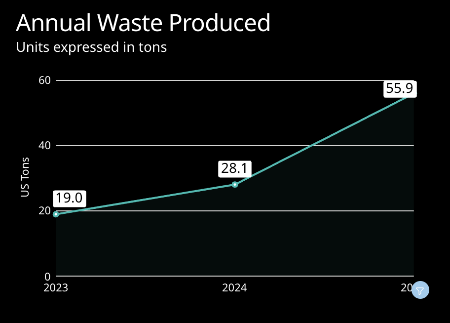
Raw data set:
total waste in weight from all venues, vendors and partners for the duration of the event, regardless of disposal method.
Why it’s helpful:
A total waste produced number tells us that this event, along with the partners and vendors supporting it, have mechanisms in place that measure and report on their waste output. As this is not a given, collecting and reporting an annual number is a great basic step to begin a sustainability journey. From there, we can get to interpretation.
This chart reveals trends, outliers, and progress along a waste journey in broad strokes. It reflects more of an upstream trend than a downstream one, showing how the event may be growing or contracting in terms of materials, footprint, attendees and participants, one-time-use builds and signage, and rebranding. It reinforces that a lot of sustainable outcomes are formed in the planning phase, no matter the sustainability of the disposal method of materials at the end of the event.
2) Waste Per Participant
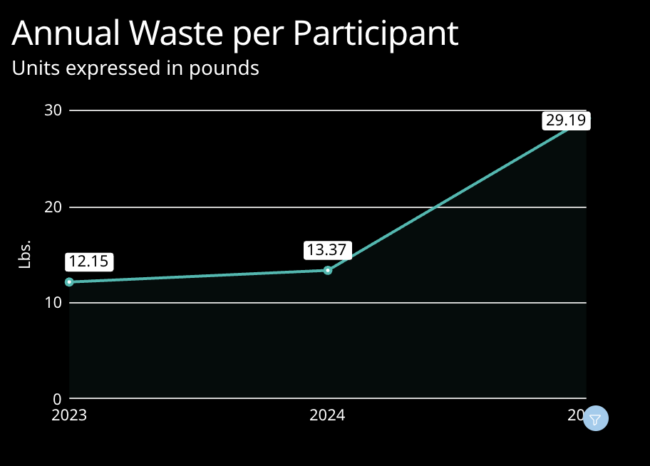
Raw Data Set:
Total waste, total event participants.
Why it’s helpful:
Looking at this data set helps us evaluate and rule out some possible factors or causes of the trends. For example, a huge spike in attendees and/or exhibiting companies would explain a larger overall waste number (previous chart), but if there isn’t a commensurate increase in attendance, we know this isn’t the case and something else is going on. Conversely, if a per-participant waste number holds steady or even decreases year over year, it may indicate that your event is scaling in a sustainable fashion.
3) Diversion Rate
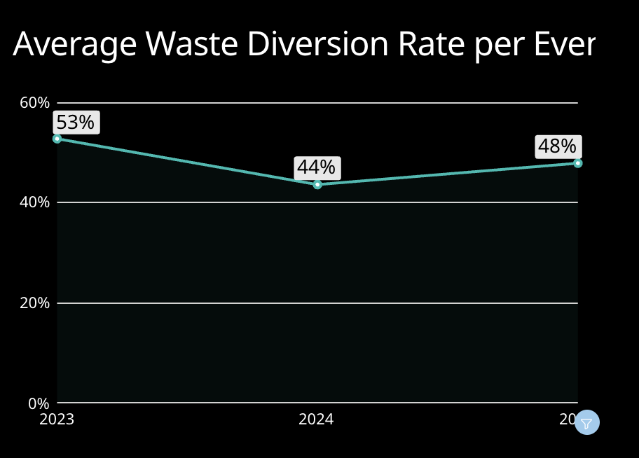
Raw Data Set:
Weight of total waste, weight of each component of the waste stream*
*how it is disposed of finally, regardless of its material or makeup (for example, if compostable serviceware is not composted, it still counts as landfill waste)
Why it’s helpful:
The diversion rate helps us look more deeply into the waste management practices of the event and venue. Here, we can see that even though the overall waste number is up this year, their diversion rate is holding steady, indicating that their practices are consistent year over year, and they’re likely coordinating well with their host venue and key partners.
4) Waste Stream Components by Quantity
Click lower right corner to enlarge video:
Why it’s helpful:
This graphic focuses in on upstream decisions like policies, mechanisms, staff training, and venue selection.
We can see for this client that they documented as much landfill for 2025 as all of last year’s waste combined, which indicates an upstream procurement and quantity issue.
This could be the result of many things, such as missing education for exhibitors and their contractors, layout changes (for example, events that opt to have booths in custom shapes will render all flooring used as landfill), non-recyclable substrate selections for signage, overages in ordering, errors… we’ll drill down into these scenarios in conversations and written reporting with our clients, but from the chart alone, we know to keep an eye on and assist the client in showing them how these upstream choices built up to illustrate a downturn in sustainable outcomes. In contrast, we can also highlight the major impact of making different choices for their next year, while keeping some of the programming that moved sustainability forward.
5) Waste Stream Components by Percent
Click lower right corner to enlarge video:
Why it’s helpful:
This chart, which removes the focus on quantity, focuses on downstream disposal. The color coding clearly shows the impact of composting (green), and donation (yellow) on the diversion rate. As these areas grow or shrink, they indicate either a new program being introduced, being phased out, or could be an aberrant year due to the capabilities of a venue or destination, for example. Even outliers can be useful information, helping the team evaluate future sites and partners.
For some of us, looking at a spreadsheet of numbers is about as helpful as looking at an alien language. However, translating those numbers into exciting and dynamic visuals helps us tell the story of what is going on, and reveals where our actions are helping us toward our goals and where we still have gaps.
As long as we can think of our event data as a tool, not as a report card, we can leverage it with level heads to inform future decisions to amplify value, lower costs, and integrate sustainability into our event operations without fuss.
Don’t be left in the dark

Connect with us on data management and HIVE!